这篇文章主要讲如何实现————头部固定,左侧固定导航,右侧主内容通过左侧的导航切换的布局。
实现效果如下图。
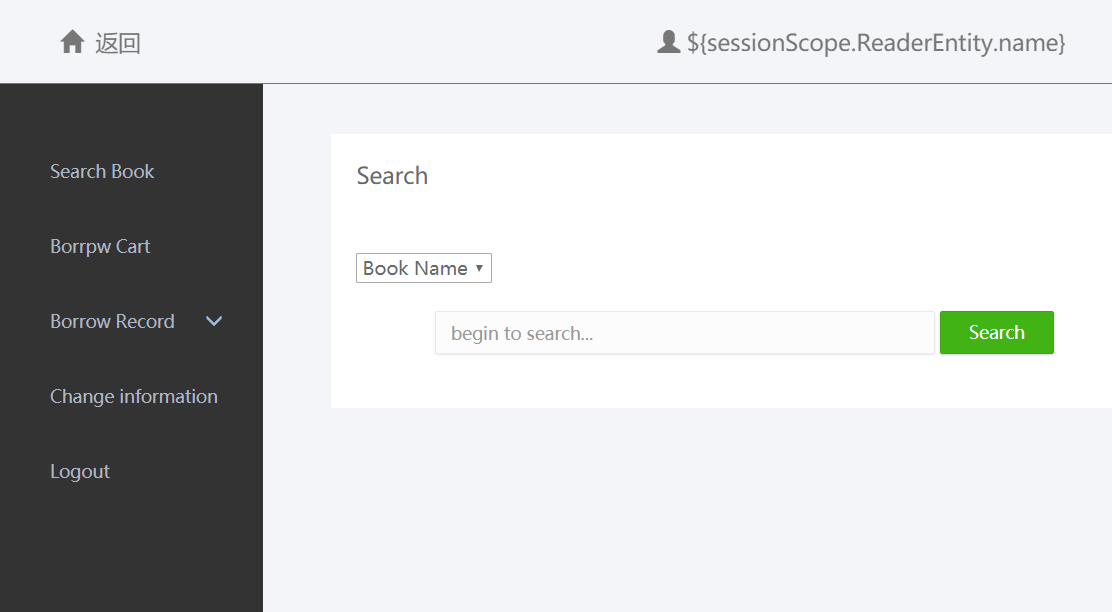
头部高度固定,宽度占全屏。
左侧和右侧主内容部分在一个main-container盒子里面。这个盒子高度通过calc - 头部高度,宽度占100%。
左侧导航宽度固定,高度占main-container的100%。
右侧主内容的高度占main-container的100%,宽度自适应。
右侧主内容显示部分采用iframe框,通过a标签的href指向iframe的name值,这样a标签跳转的页面就能显示在iframe框里。而iframe的src是其实状态要显示的页面。
DOM结构
<body>
    <div class="header">固定头部</div>
    <div class="main-container">
        <!-- 左侧边栏 -->
        <ul class="nav">
                <li>
                    <a href="page1.html" target="showBox">页面一</a>
                    <a href="page2.html" target="showBox">页面二</a>
                    <a href="page3.html" target="showBox">页面三</a>
                    <a href="page4.html" target="showBox">页面四</a>
                    <a href="page5.html" target="showBox">页面五</a>
                </li>
        </ul>
        <!-- 右侧显示部分 -->
        <iframe src="page1.html" name="showBox"></iframe>//点击上面的a链接,src值自动变成href值
    </div>
</body>
css样式
html,body {
    width: 100%;
    height: 100%;
}

.header {
    width: 100%;
    height: 100px;
    background: #323437;
    border-bottom: 1px solid gray;
    text-align: center;
    line-height: 100px;
    color: #fff;
    font-size: 20px;
}

.main-container {
    width: 100%;
    height: calc(100% - 101px);//加上1px边框
    display: flex;
}

.nav{
    width: 200px;
    height: 100%;
    background: #323437;
}

iframe {
    flex: 1;
    height: 100%;
    background: #212224;
    margin: 0;
    border: 0;
}

ul li a {
    display: block;
    color: #fff;
    text-decoration: none;
    font-size: 20px;
    text-align: center;
    padding: 20px 0;
}
如何使得某元素占满这个页面呢
首先让 html 和 body 页面占满100%
html,body{
    width: 100%;
    height: 100%;
}
给要占满页面的元素设置100%即可。
div.container {
    width: 100%;
    height: 100%;
}
如果内容元素设置了高度,超出页面造成scroll出现,通过overflow:hiden可以去除scroll